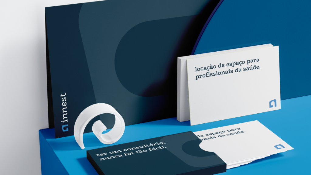
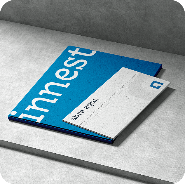
a company that offers office rental services for healthcare professionals, such as psychologists.
they have spaces with diverse options, providing professionals and their patients with the best possible experience in quality consultations.
the project
was initiated in 2024 as a branding proposal for a company that aims to facilitate the outsourcing of consulting rooms, especially for Psychology professionals.
from the beginning, the company wanted to convey the message that they are something "different" from what is found on the market, that is, a new concept; therefore, the branding does not follow the visual patterns that we usually find in similar companies, but innovates in several points.
the project took about 2 months to complete and had little influence from the client.
this project is multidisciplinary in essence, as I created graphic materials, motion graphics (2D and 3D), interactive systems, and 360 marketing strategies.
(no AI was used for the 2D or 3D graphic elements)
the central idea is
to be different from what is on the market, creating greater prominence and reflecting its innovative nature.
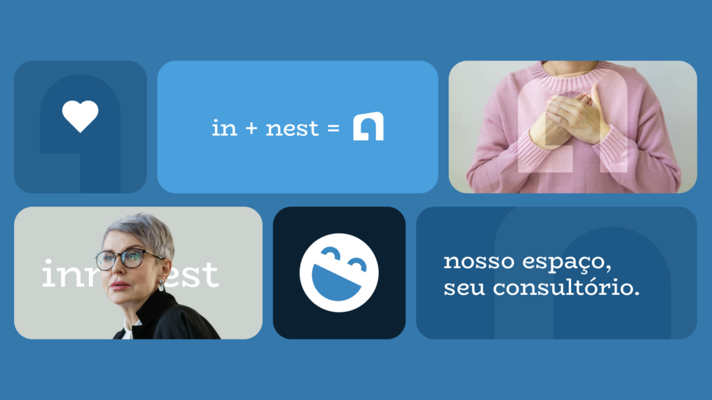
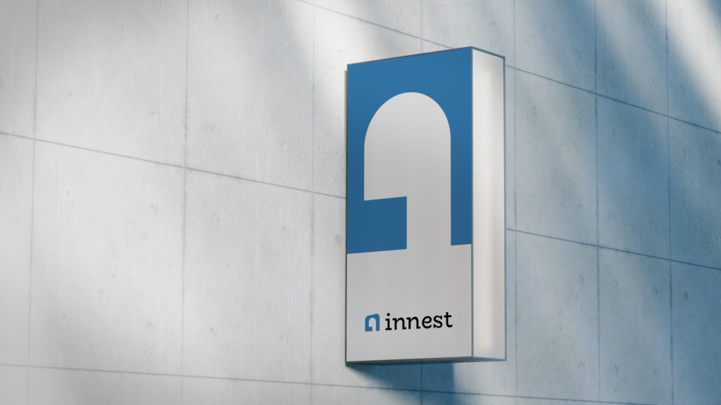
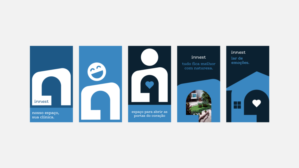
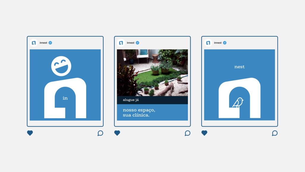
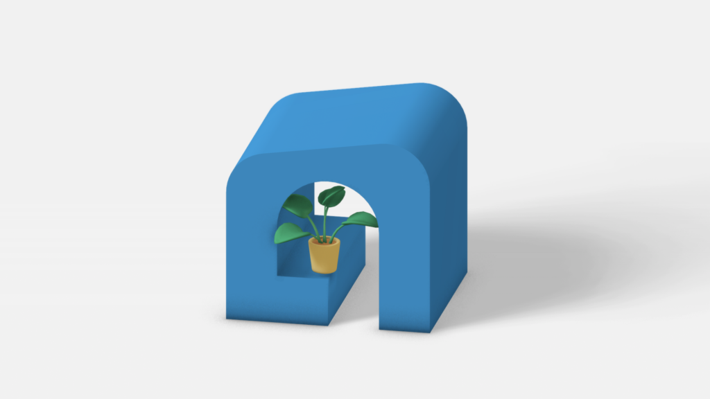
the symbol was created with its dynamism in mind; with it, it is possible to reflect various meanings that together represent the company's philosophy.
the symbol
is completely dynamic, which allows it, for example, to be used to represent different types of emotions.
thus, it is possible to have a wider range of uses in the creation of marketing materials and brand positioning.
the ecosystem
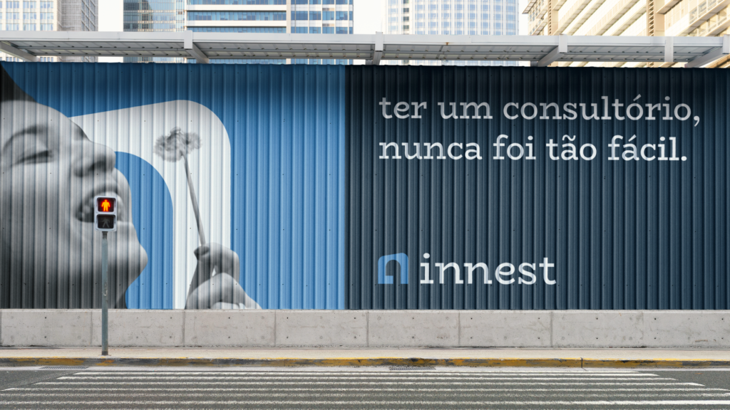
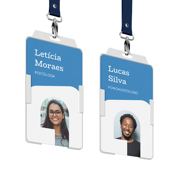
brand's design was developed around its healthcare language.
materials ranged from formal documentation to clothing samples.