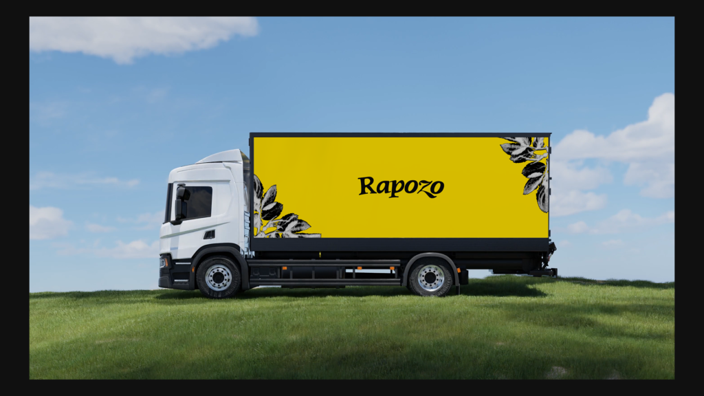
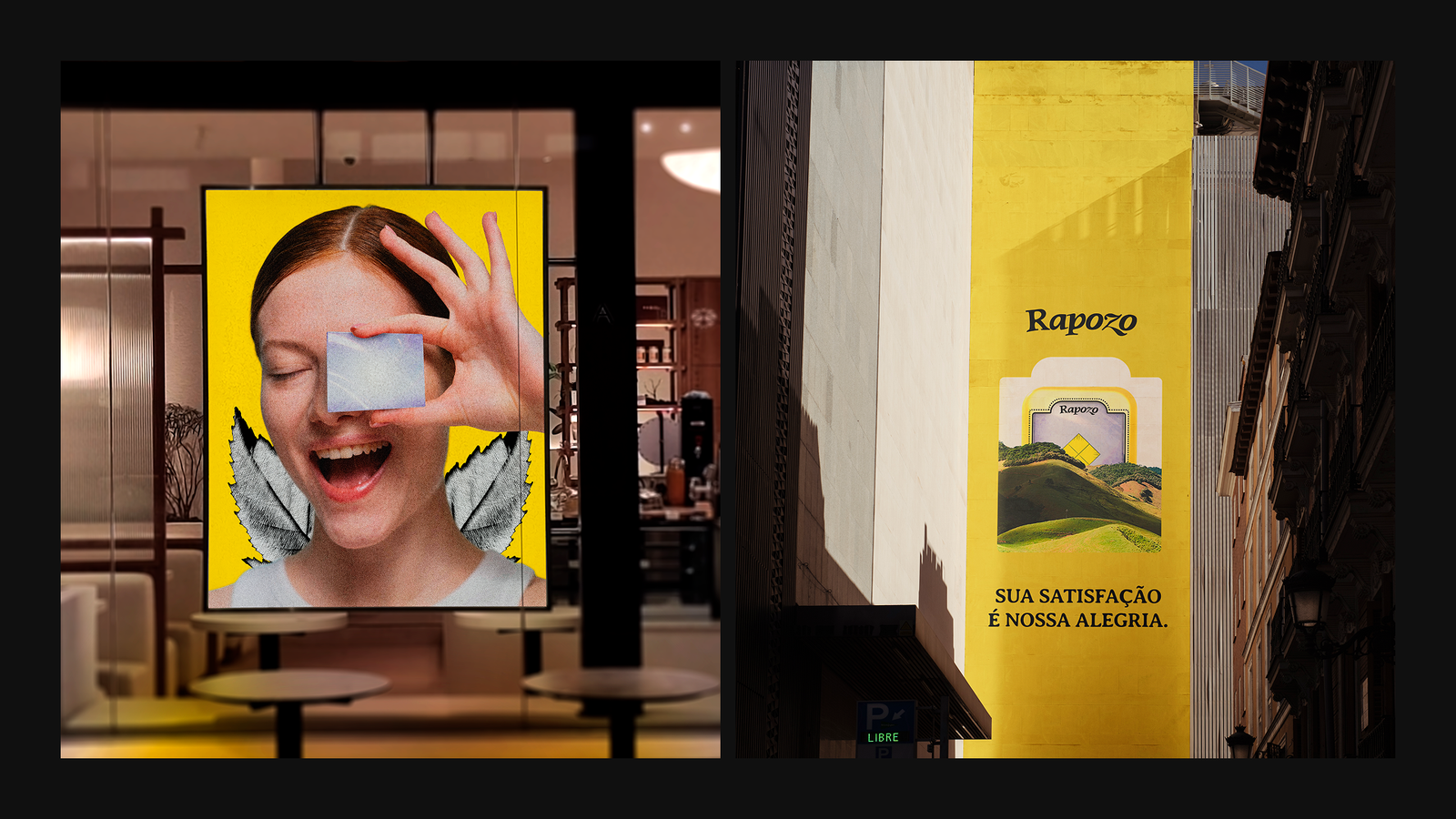
rapozo is a century-old and traditional Brazilian company that distributes and creates cosmetics.
the project aims to modernize the brand, which had remained unchanged for over 10 years and was no longer able to connect with the new market demands and consumers.
the project
began in 2026 with the goal of revitalizing a traditional Brazilian cosmetics brand that was experiencing crises due to its inability to keep up with market changes.
from the start, we engaged directly with the company's founder and CEO to discuss their vision for the rebranding and future of the company.
one of the main pillars we were told to maintain was the idea of tradition. Despite the revitalization, we needed to demonstrate to the market that we are the oldest brand among our competitors.
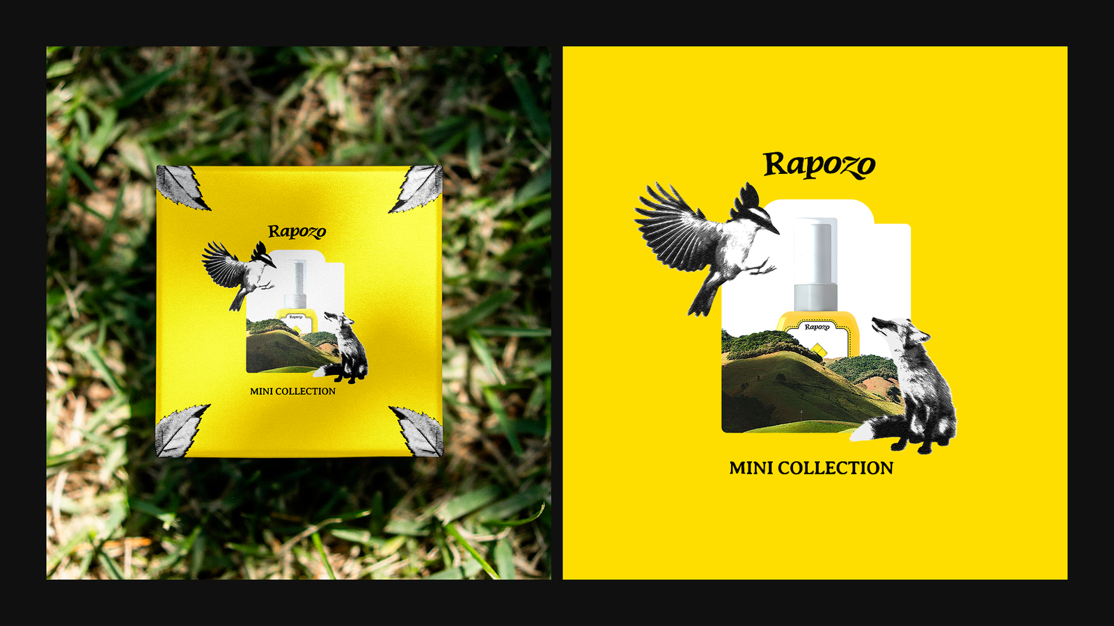
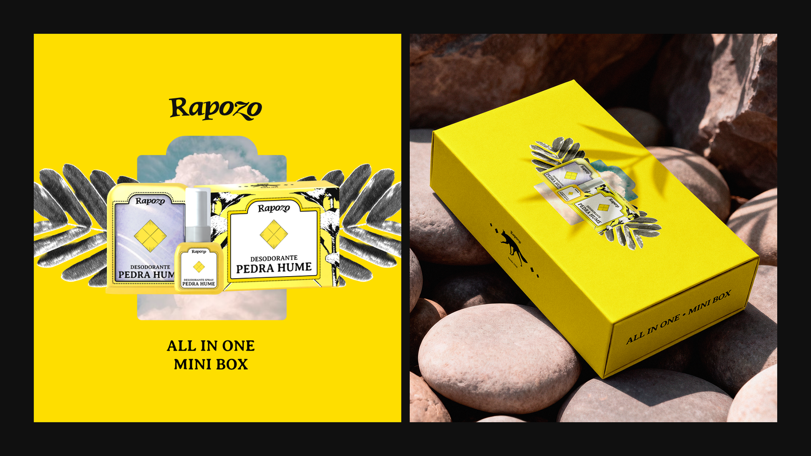
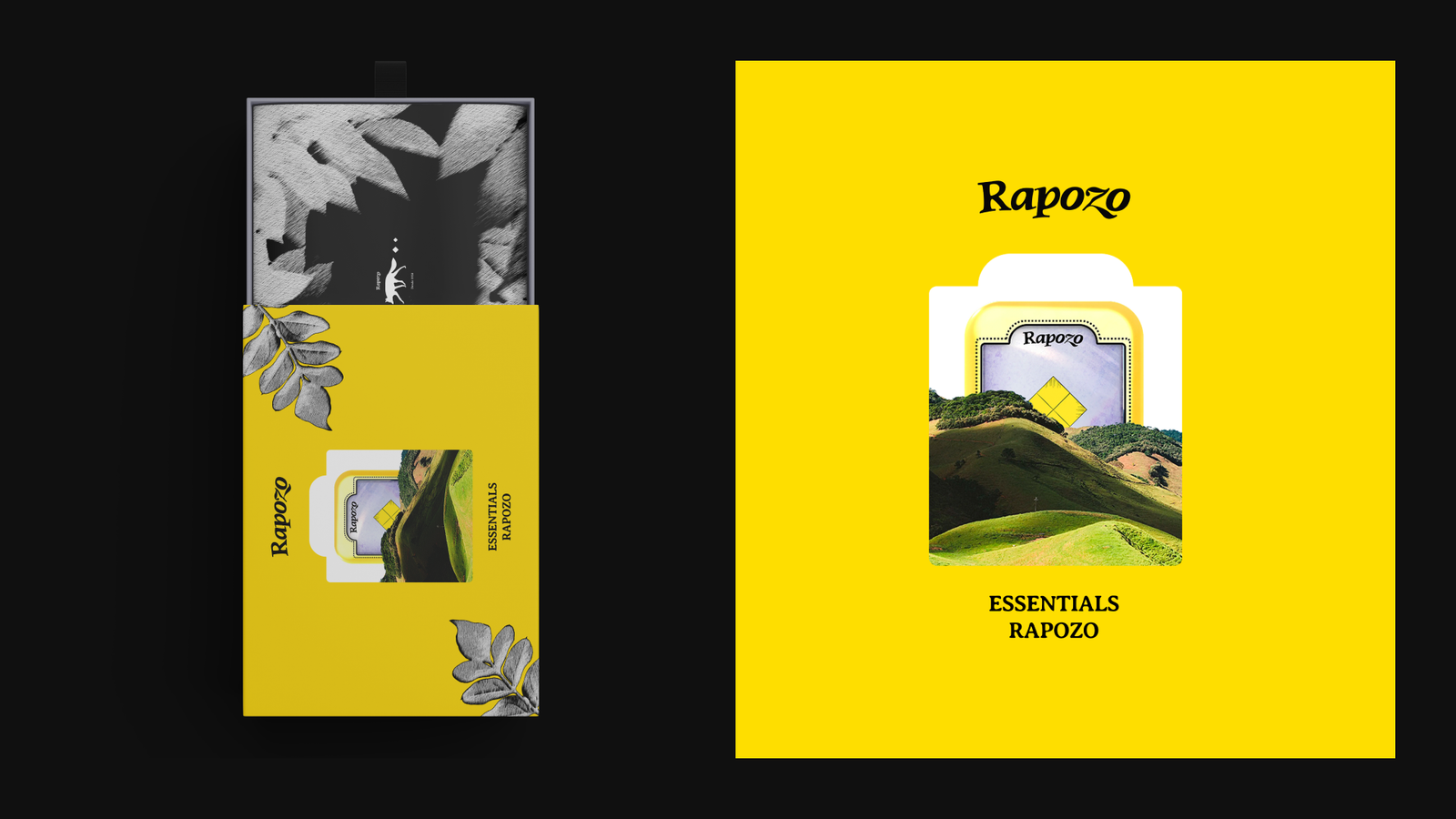
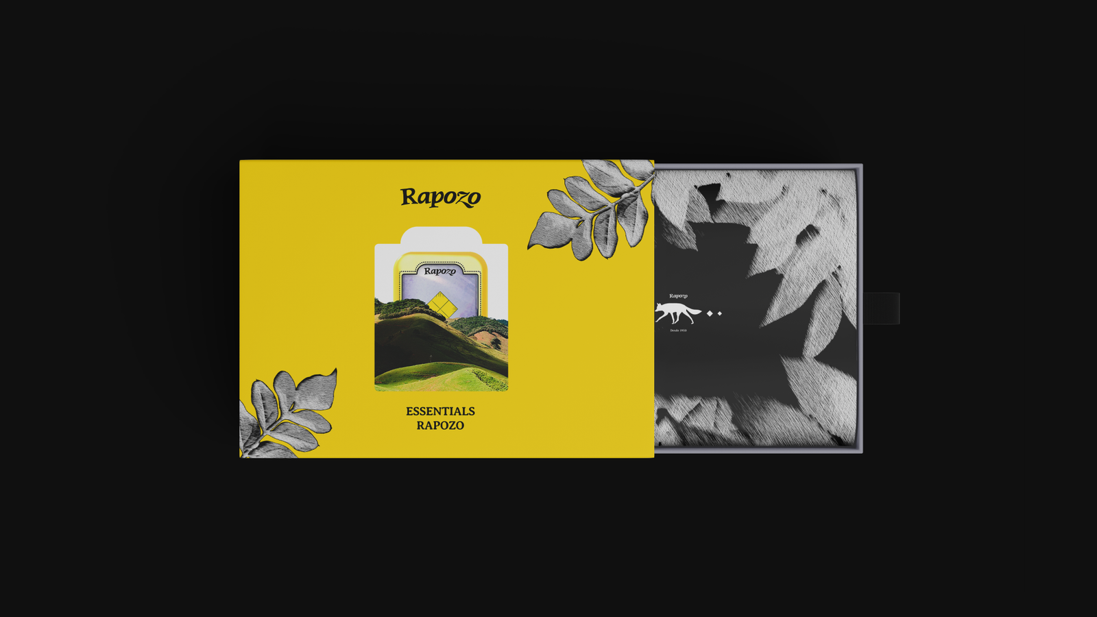
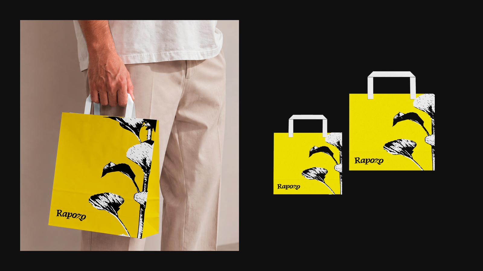
in addition to the revitalization, we also went further and proposed new products and packaging.
in this project, I not only conceived but also created all the designs presented here, from the 2D to the 3D models.
(no AI was used for the 2D or 3D graphic elements)
the central idea is
to modernize and incorporate neoclassical elements while maintaining a traditional feel.
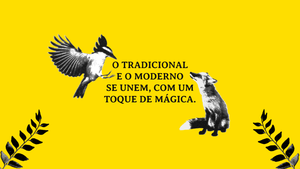
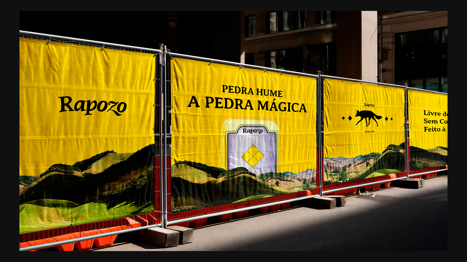
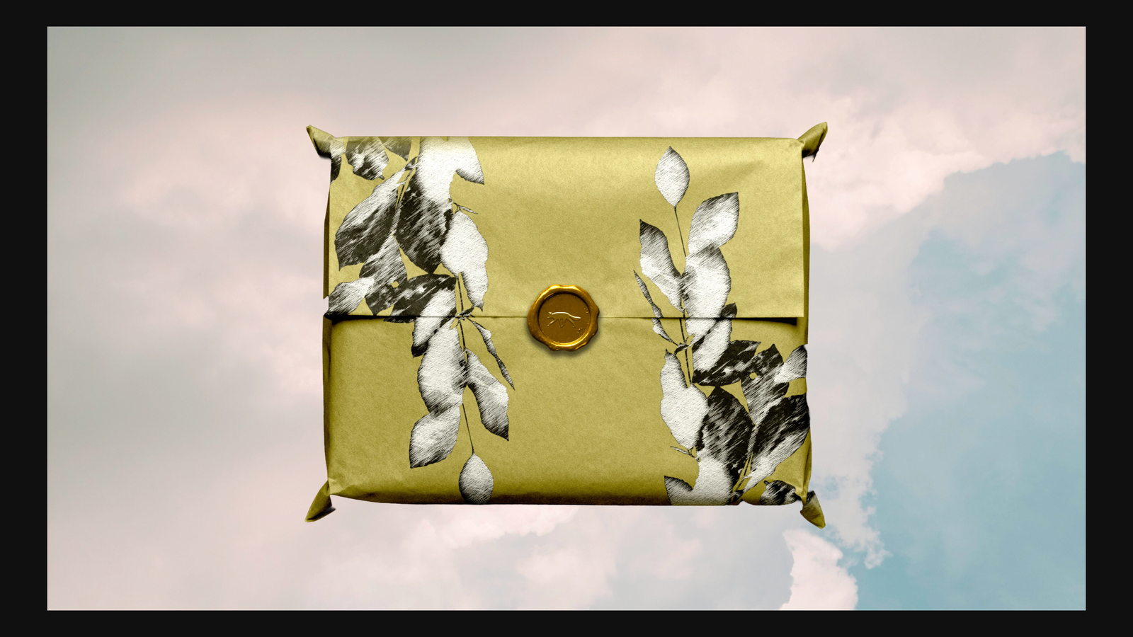
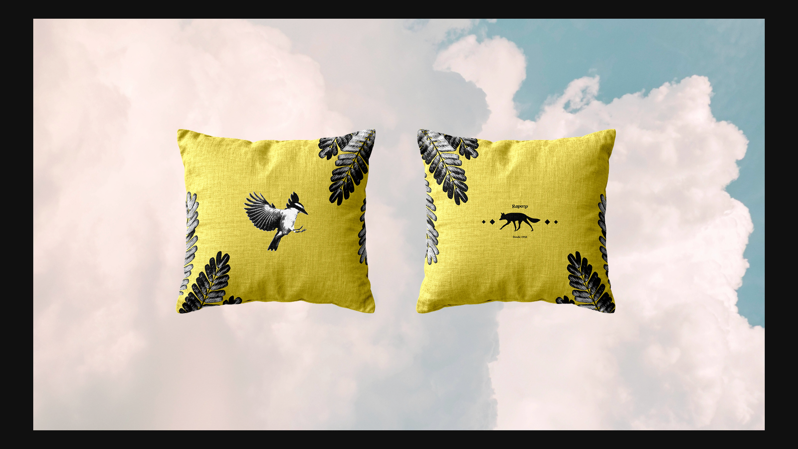
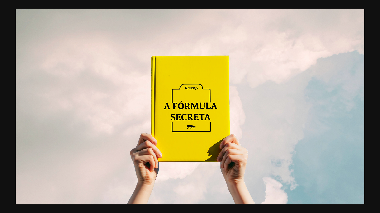
we also didn't want to replicate the market formula, so we sought to create a unique aesthetic that could also have its own universe and convey the sensation of a "magical world."
the idea of a magical world is not only part of the marketing being applied to the products, but it's also something that strongly appeals to the new generation, especially in the digital world.
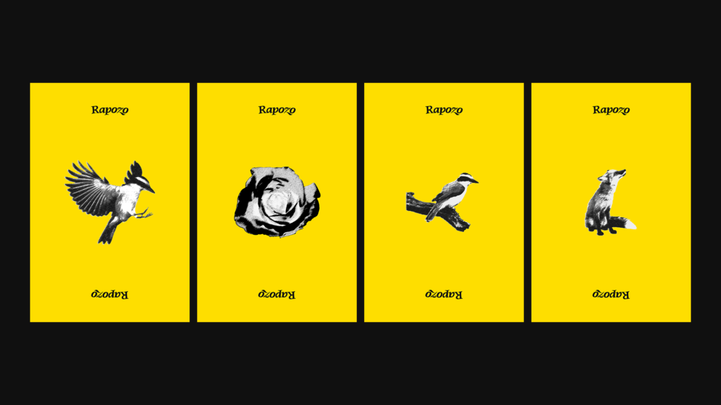
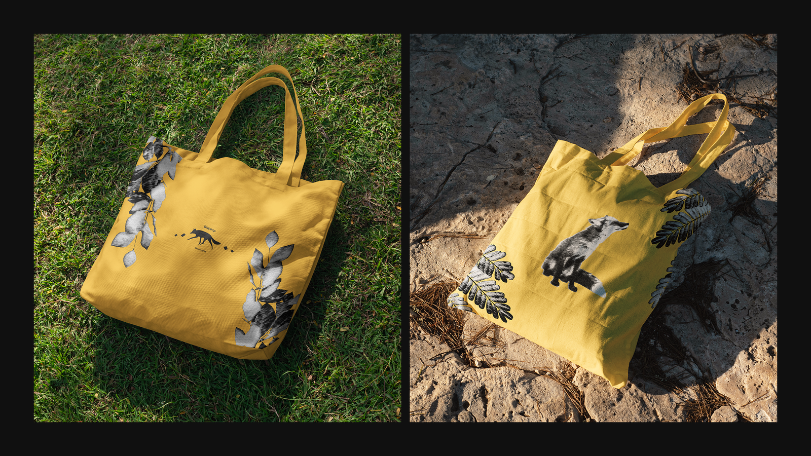
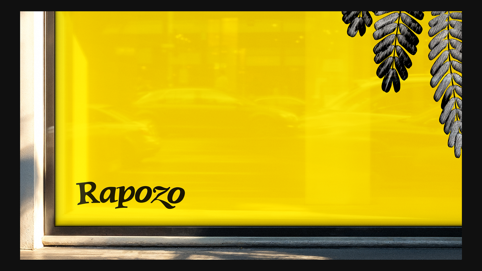
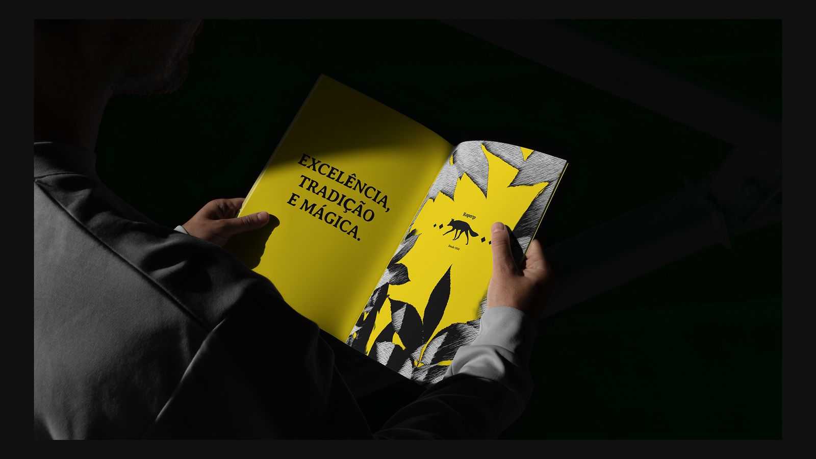
one of the things we created to facilitate this was a fully customized software to apply a unique filter to any photos we might use—this hatching effect, for example.
the symbol
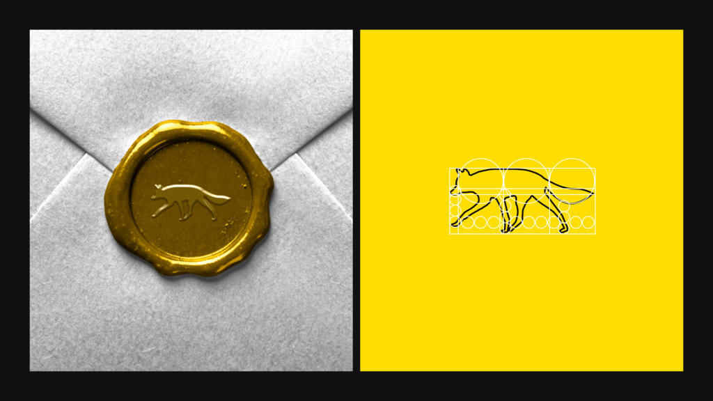
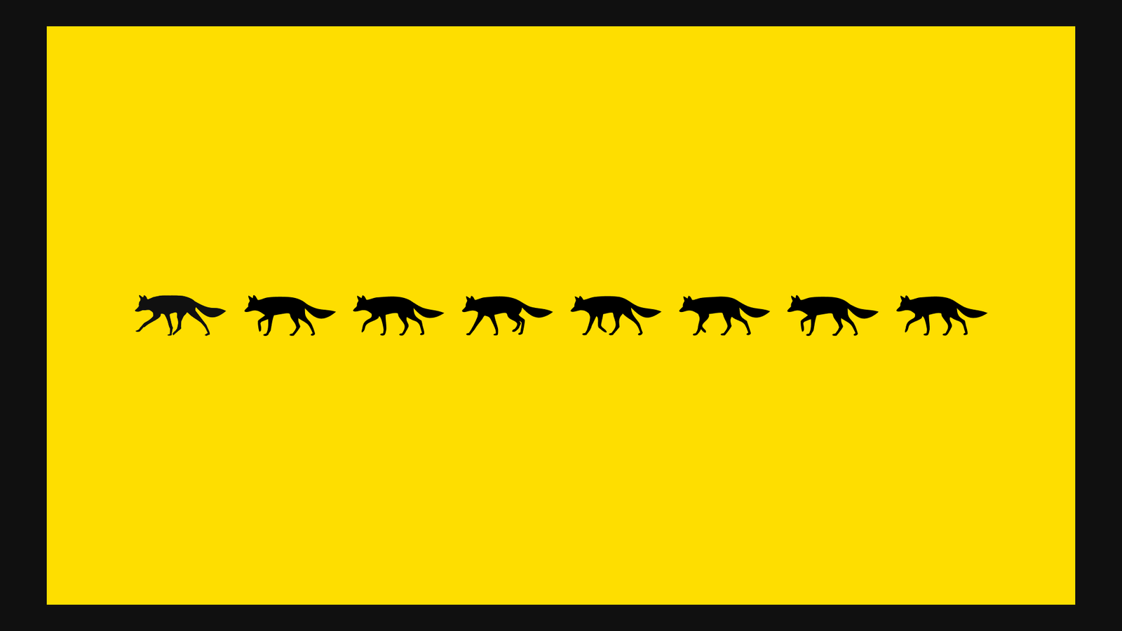
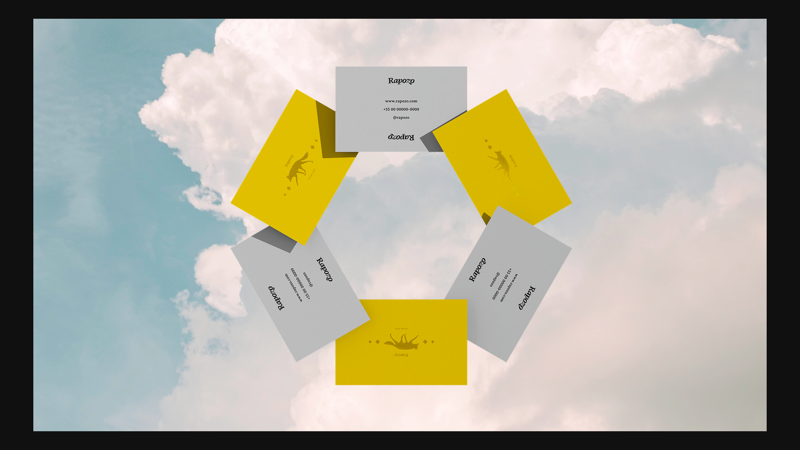
was designed to immediately summarize the entire brand in a single graphic element, thus making it totally iconic.
although the name doesn't refer to a fox but rather to the founder's surname, after conducting extensive research we noticed that approximately 90% of people associated the name with the animal.
we took advantage of this to create an element dynamic enough to create emotional connections with the public and consequently bring them closer to the brand.
the new product
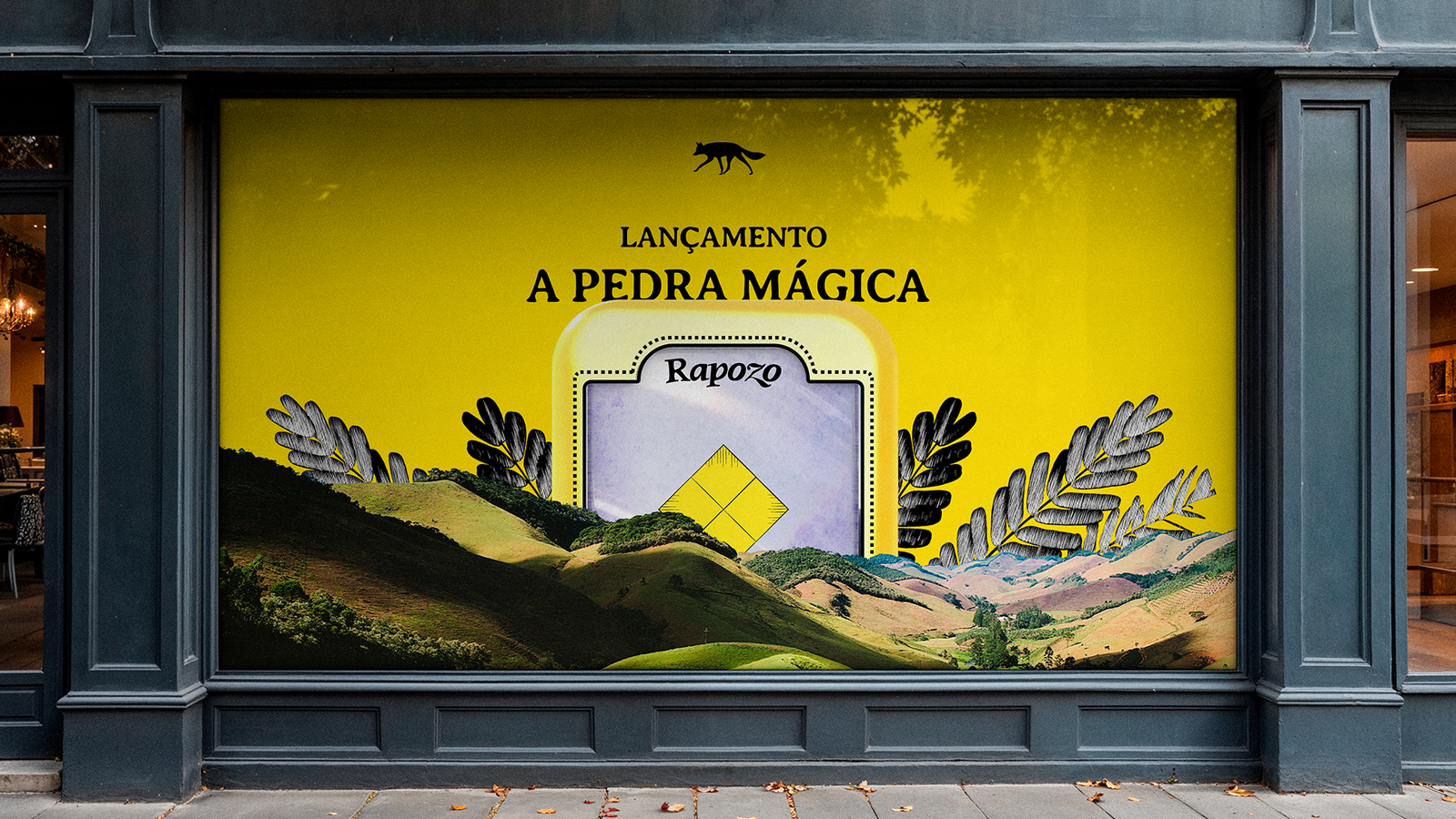
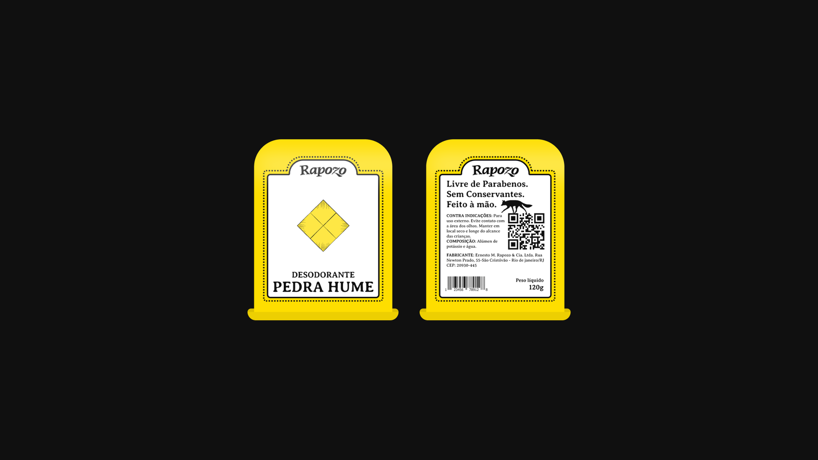
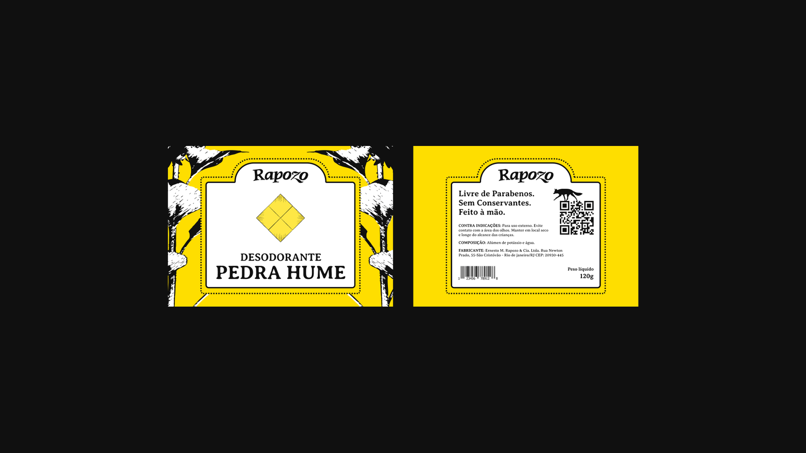
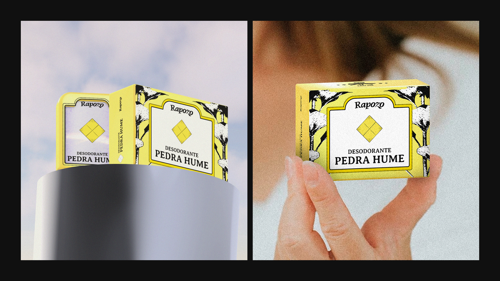
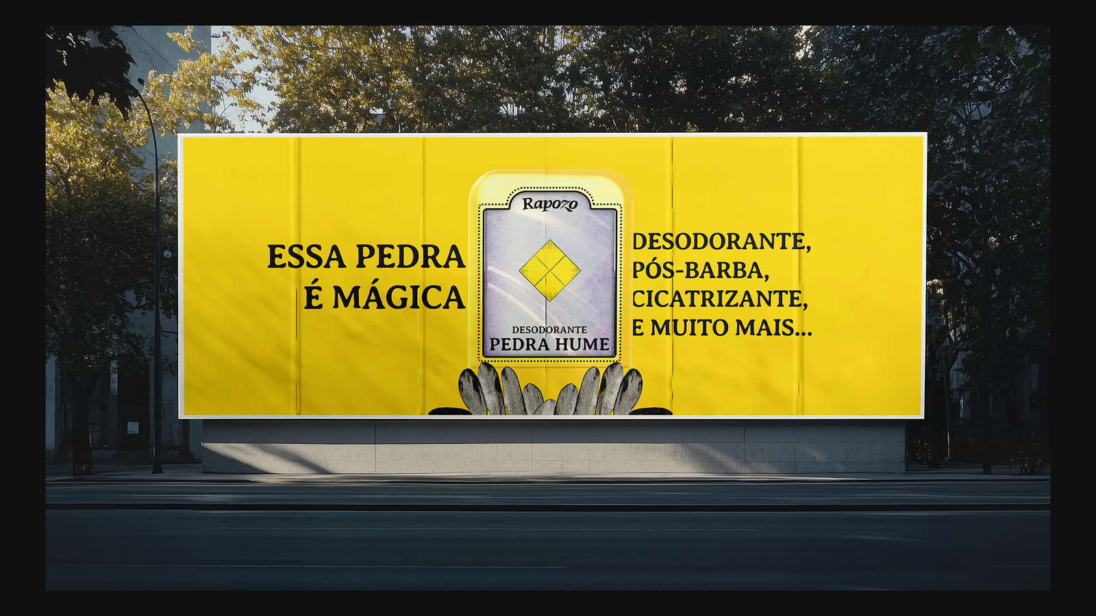
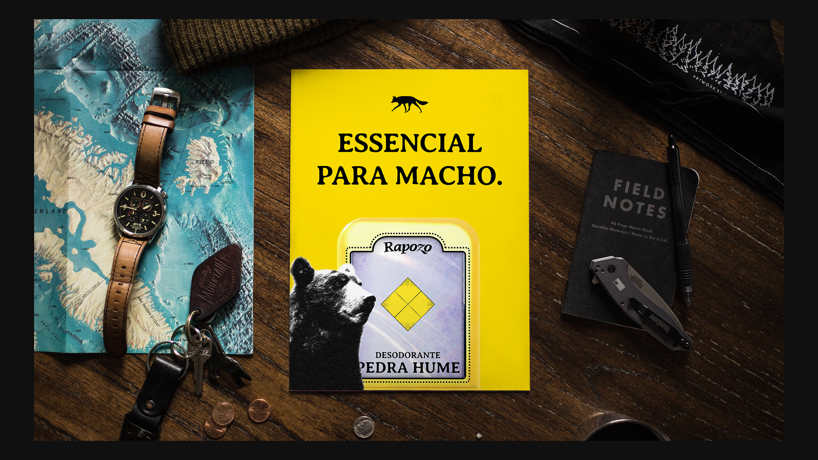
was created based on the company's best-selling product called "Alum Stone".
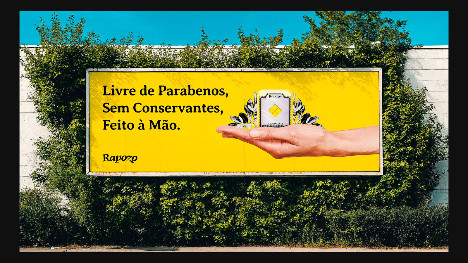
our proposal, however, was to create the same product with a different design, to especially appeal to new generations.
the design is completely original and there is nothing like it on the market; its dynamism takes advantage of the stone's own color to create lighting effects, thus giving the impression of being a "Magic Stone".