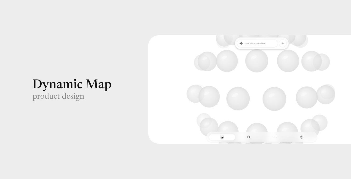
A unique way to search for and find content, with a distinctive style and interactive features.
it all started
with a question: how can we create a news feed for our app that not only has a look and feel never seen before, but is also dynamic enough to allow for non-linear searches?
this feature was conceived when I was working on the Shop My Feed app. We needed an explore page to allow users to find posts.
however, we no longer wanted to submit to what already existed on the market; what we found out there were linear discovery systems, which present themselves as an infinite vertical scroll (like on Instagram), or a horizontal swipe (like on Tinder).
the idea of allowing non-linearity was precisely so that we wouldn't trap the user in the idea that they necessarily need to keep scrolling, but so that they would see the page as a "map" on which they embark on an adventure, without a single correct way to navigate.
the initial idea was that it would only be used to find products, however, Gustavo (CEO of Shop My Feed) proposed expanding the search to include posts as well.
after extensive research, even using LLMs to find it, we discovered that this is the first app in the world to have a post/news discovery system with this appearance and purpose, making this a unique invention.
in practice
how does it work?
it's very simple
because since the user isn't bound to a "correct way" to navigate, they can simply navigate infinitely in whatever direction they want.
in terms of animation and micro-interactions, I designed it in a way that the user could enjoy navigating; everything is quite fluid, similar to bubbles -- which also reinforces the brand's own branding.
momentum
if the user moves quickly, the globe itself creates an acceleration that corresponds to the intensity of the movement made by the user.
distortion
depending on the speed, the bubbles distort slightly, creating a rather fluid impression.
chromatic aberration
the further away from the center, the smaller and more distorted the bubbles become, creating a chromatic aberration effect, as if we were looking through a lens.
snap
it calculates which bubble is closest to the center and automatically snaps it, without the user needing to accurately position a bubble.
zoom
in both the desktop and mobile versions, the user has 5 zoom options available. the zoom also has a snap function, and regardless of where the user is dragging, it will always stabilize in the center of the screen.
touch
it is also possible to navigate by clicking directly on the bubbles, making the globe move directly to where you clicked.
loading
there is also a loading screen that occurs before the posts are loaded, to indicate to the user that the posts are loading. when it finishes loading, it expands and smoothly transitions to the post view. its appearance is also designed to simulate bubbles.
responsiveness
designed for mobile-first.
totally flexible
working perfectly for any screen size.
on mobile screens specifically, subtle interaction adaptations were made to facilitate user movement without requiring abrupt finger movements. To achieve this, we created an algorithm that calculates the angle of the finger and the swipe to deduce the movement and speed it up.
the result
the results made the path clear.
Engagement
- A fair number of users praised the aesthetics of the explorer.
- Users have reported being "addicted" to the explore feature and really enjoying the feeling it gives them.
Branding
- The app stands out from any other on the market, especially from its competitors.